Startup Idea: The 6 Steps To Solve Personal Analytics
I’m giving away my startup ideas because I’m focused on building my new startup, YesGraph. We help your app grow, so if you like this post go try out YesGraph!
I love the quantified self movement. I have avoided the space because the market seems small. If you consider the number of people that want to lose weight, quit smoking, or get better at something, I’m probably wrong about the market size. It’s huge.
No one gets it right today. Here are a 6 things you need to do to win.
1. Grab Everything With An API
If you want to use data to make lives better, you need to first get the data. It isn’t just your Withings scale weight or some pedometer data. If you want to find correlations to deliver insight, you need to get as much data as possible.
Every word written: email, docs, dropbox, sms, tweets, status updates.
Every piece of content created: mobile camera roll, instagram, facebook, vine.
Every piece of content consumed: amazon, itunes, netflix, spotify, rdio.
Every place you go. Every dollar you spend.
You won’t start with 100 services, but you’ll get there soon enough. Some people will be obsessed with adding more data. They are your super users and you just need to listen to what they want.
2. Avoid Data Entry, But Make It Easy
Things that don’t have APIs still matter. It is hard to track meals, caffeine, alcohol, sugar water, nicotine, sex, sleep and exercise. It isn’t a coincidence these things correspond with common goals to improve. We don’t track them, which makes control harder.
Tracking apps are narrowly focused around one thing (food tracking, but not sleep or anything else). Another problem is that the interfaces dive right into details at the expense of making recording anything at all too hard. This makes habit forming and on-boarding terrible. If you need to type, the interface is already too complicated. Most food tracking apps focus on getting an accurate calorie count, which is absurdly complicated. Each layer in that sandwich is going to take 20 clicks.
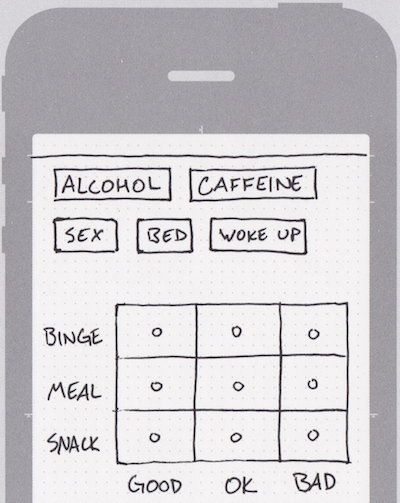
I propose a simple data entry framework: click a button, and that event gets tracked. Here is an interface that would let you record caffeine, alcohol, sex, sleep, and meals. Each meal also shows portion size and goodness of food. What does good or bad mean? Whatever you want.
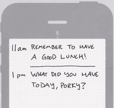
Short journal events are a good format too. Such entries can be short bits that will help in other areas, like annotating graphs, like the graph below.
3. Mobile Matters
You can’t avoid building mobile apps. It makes connecting to valuable data sources easier. Think location tracking, messaging, movement. It makes data entry easier too, with a fast native interface a click away. Perhaps most importantly, it makes prodding users to do the right thing much easier, and that includes doing the requisite data entry.
You can get creative with what you track too. Think battery levels, phone docking, alarm clocks to help track sleep, and many other things.
Nicholas Feltron is famous for making personal annual reports with an incredible amount of data visualized. Here is his 2012 report. In it, he describes a custom app that helped gather all the data. The app asked him questions at random times of the day, like “who are you with?” and “what are you doing?”. Build this app for everyman.
4. Emphasize Insight Over Visualization
Extracting insight from a graph is actually really hard, and many people find graphs confusing.. Many services in the space show graphs without highlighting what matters. This is distracting from the real goal. Remember Nicholas Feltron? Maybe I lose some design cred for saying this, but I didn’t learn much from his report. Insight and beauty aren’t mutually exclusive, but beauty is so compelling it can force itself into the open without utility.
You might want to try something minimal at the start. Don’t. Graphs without the ability to manipulate data are worse than nothing. Control and agility means users can try to find their own insight before you’re sophisticated enough to do it for them.
I have a Withings scale, and love it for the ease of recording weight data. Their dashboard consists purely of time series data without understanding of causality. This is a result of not having the data and not using what they don’t have.
Below, I overlay some rough journal entries over the time series.
When you see this graph without annotations, the meaning is harder to discern. Worse is that the time series is probably the worst way to visualize the content here. Look at the density of measurements correlated to the direction of the graph. If I measure more, I lose weight, and if I measure less, I gain weight. This is why focusing on insight matters: it is actionable to conclude that measurement frequency is important (measure more!) but the time series alone isn’t actionable.
5. Machine Learning Matters
You’re building a machine learning company if you’re in this space, whether you like it or not. If you don’t have a focus here, that just means you’re doing a bad job. Your mission statement is to user data to improve lives, so it just isn’t reasonable to avoid becoming experts in finding insight from data.
The big question here is to what degree your models need to be customized for different goals. You should seriously consider seeking out what problems many users have, and finding ways to help with diving into their data. It doesn’t scale, but the point is you’re building models for different situations.
This is actually a huge part of the opportunity with the data. Today people toiling over their own janky charts and logs. Giving them better tools will make their lives better. But getting everyone’s data in one place means that you might be able to find patterns individuals alone are missing. It goes without saying that having all the data for many people in one place is incredibly valuable. It is a defensible position with a strong network effect, a lot like Google click data.
Also like Google, more data will matter more than a fancier algorithm. Google famously used anchor text to dramatically improve search. This is one reason why getting a lot of data into the system matters. Adding a new data source is going to be easier than creating a more complex algorithm, and it will probably have a bigger impact too.
6. Social Support & Distribution
Getting friends involved is an effective way to hit a personal goal. I recently publicly posted about an absurd goal to do a one-armed pull up. Both fear of public shame and the enthusiastic support of friends have been great motivators.
Some services embrace this partially. The street team on Runkeeper comes to mind.
Remember, you should already be feeding in data from every social service. Your users will already be authed to leverage that data. Now all you need to do is help them ask friends to help them.
Structurally, you will have users that ask other users to join your service. Congratulation, you now have a distribution mechanism!
Do you want to start working on this? Do you want to invest in this idea? Do you think this is all absurd? Get in touch: ivan.kirigin@gmail.com.
Subscribe to get more new ideas.


